Compare Club Design System 3.0
The problem with growing fast
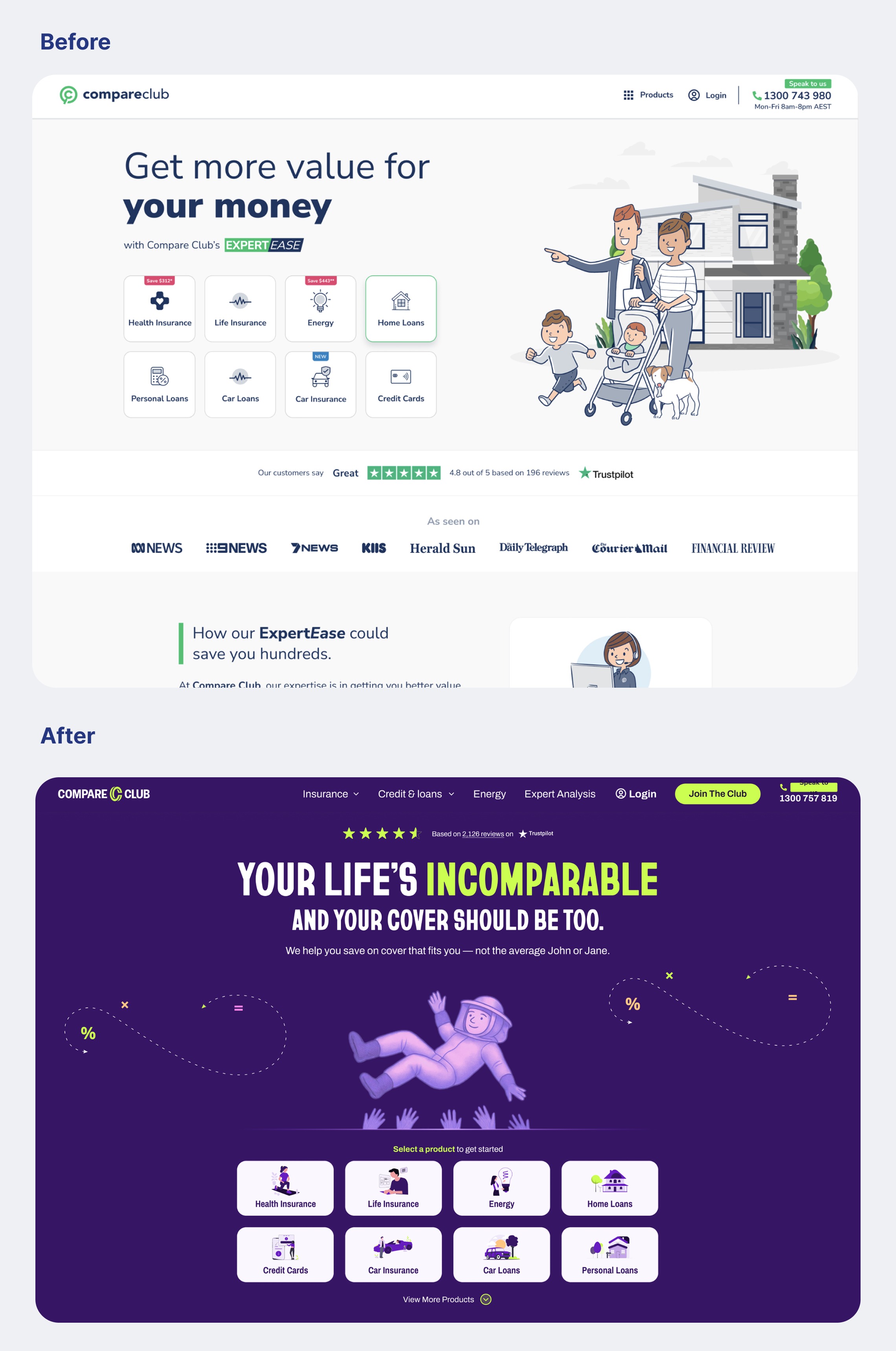
Compare Club had grown through acquisitions and independent product launches. Each product team built their own UI components. The same button existed in five different styles across five different codebases. Forms looked different on every page. Spacing, typography, and colour were treated as local decisions rather than system decisions.
The result: inconsistent user experiences, duplicated design and engineering effort, and a brand that felt fractured at the component level. Our original design system couldn't support the portfolio anymore.
Building the system
I led both vision and delivery.
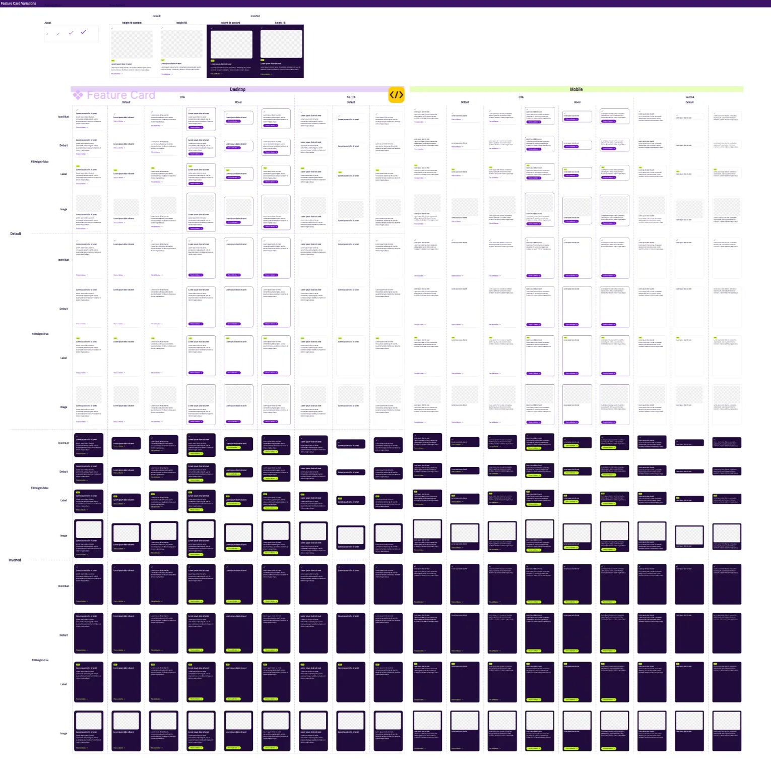
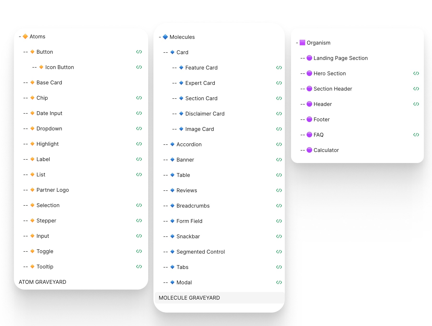
Audit first. Before building anything, I catalogued every UI pattern across all products. The audit surfaced the scale of the problem: over 100 variations of components that should have been standardised.
Design foundations. Colour, typography, spacing, grid systems. I established design principles ("Simple, Modern, Friendly, Accessible") as active decision-making filters, not decoration. Every component decision ran through them.
Figma library. The team built a shared component library using Figma variants and properties. I set the standards and directly contributed foundational elements: type scale, button systems, form patterns. The library was designed for scalability. Adding a new product vertical should take hours, not weeks.
Documentation and rollout. Documentation was built into Figma components, not stored in a separate wiki that nobody reads. Rollout was gradual, starting with high-traffic pages. I aligned closely with front-end teams to maintain code parity. A component in Figma had to match the component in code. No exceptions.
The hard parts
Different products, different needs. A health insurance comparison page and a home loans calculator have genuinely different UI demands. The system needed configurable components and variants, not one-size-fits-all templates. Finding the right level of flexibility without losing consistency was the core design challenge.
Cross-team adoption. A design system nobody uses is just a library. I ran regular reviews and stakeholder workshops to build ownership across teams. Designers contributed components back. Engineers flagged gaps. The system was collaborative by design, not imposed from above.
Mentoring through the process. I used the system build as a development opportunity, mentoring four product designers and one junior designer. Each designer owned components end-to-end: research, design, documentation, and engineering handoff.
Results
The system became the foundation of Compare Club's rebrand. It didn't just make design faster. It made the product feel like one product for the first time.
What I learned
A design system is a team sport disguised as a technical project. The hardest work isn't building components. It's building the habit of using them. Governance, contribution processes, and shared ownership matter more than pixel-perfect tokens. Without buy-in, you're maintaining a library that collects dust.