Redesigning the health insurance comparison experience
The comparison that wasn't
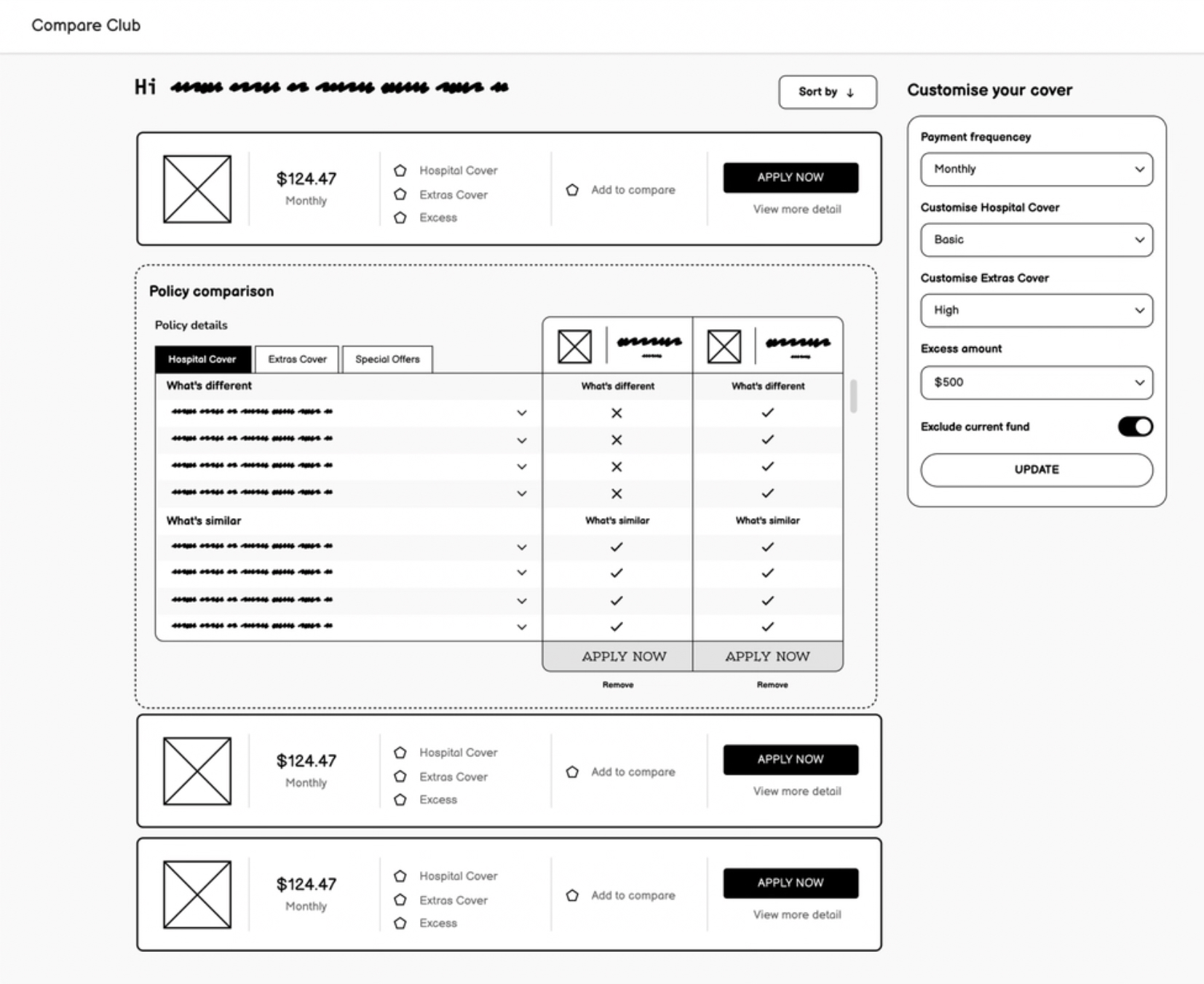
Compare Club called it a "comparison experience." It wasn't. Users filled in a quote form, hit submit, and received a list of policies sorted by price. No way to compare them side by side. No way to see what was actually covered. No way to customise without starting over.
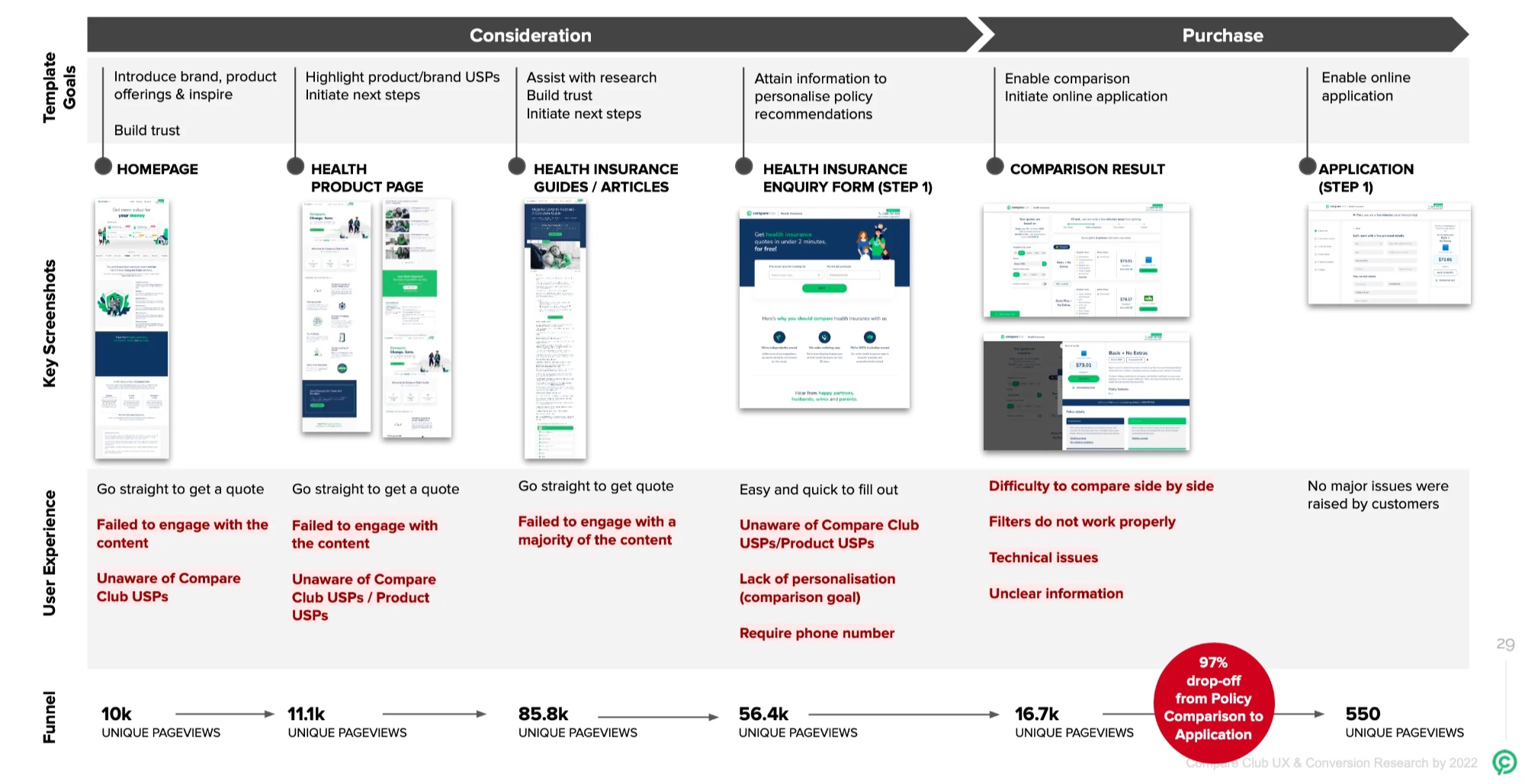
The result: 174,000 sessions and 16,300 quotes in a single quarter. 90 completed online applications. That's a 0.04% conversion rate. The other 99.96% either left or picked up the phone.
The business was running on call centre volume. That's expensive, hard to scale, and completely at odds with what users actually wanted: to make a confident decision on their own.
Understanding why people were leaving
I led research across four methods to understand the 97% drop-off after quote results.
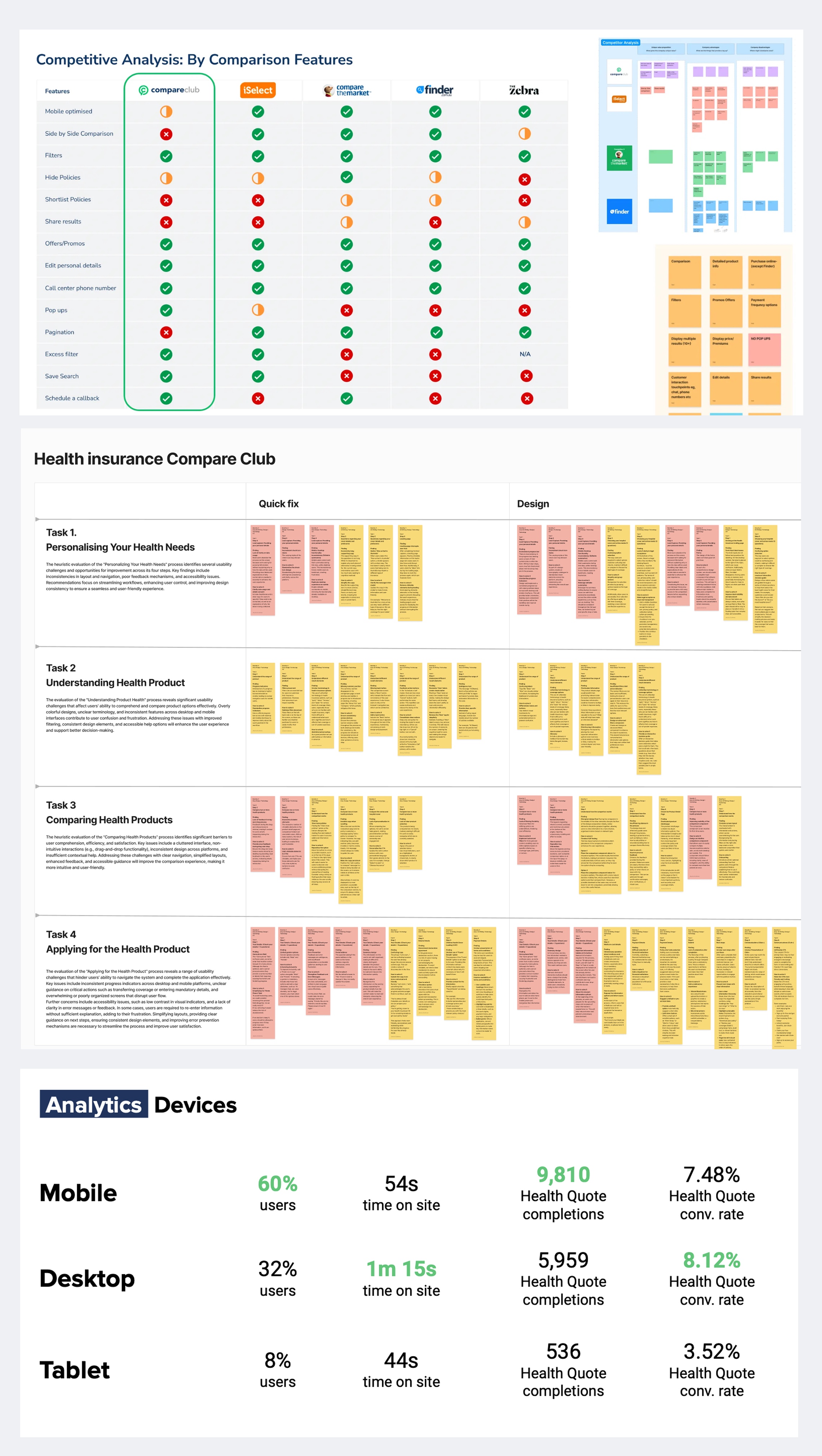
Analytics deep dive. Mobile was 60% of traffic but converting 10% lower than desktop. The primary cliff was immediately post-quote. Younger users (25-44) were engaged but not converting, pointing to UX friction rather than lack of interest.
Hotjar sessions. I ran weekly "Hotjar and Chill" sessions with the team, reviewing screen recordings together. Users struggled with navigation, couldn't find policy details, and repeatedly abandoned when the comparison functionality didn't do what they expected.
Email survey (712 responses). Confirmed the pattern at scale. Users wanted side-by-side comparison, transparent benefit information, and the ability to customise without restarting.
Remote interviews (10 participants, 70 minutes each). Moderated think-aloud sessions with people actively shopping for health insurance. The interviews surfaced emotional pain, not just usability problems. People felt overwhelmed, suspicious, and unable to trust what they were seeing.
One participant put it plainly: they couldn't compare. That was the whole point of visiting a comparison site, and the product wasn't delivering on the promise in its own name.
Four breakpoints in the journey
The research pointed to four distinct failure modes, not one general "bad UX" problem.
Value blindness. The interface sorted by price. Users were looking for value. The cheapest policy isn't the best policy when you need dental, physio, and a decent excess. The ranking didn't match the decision-making model.
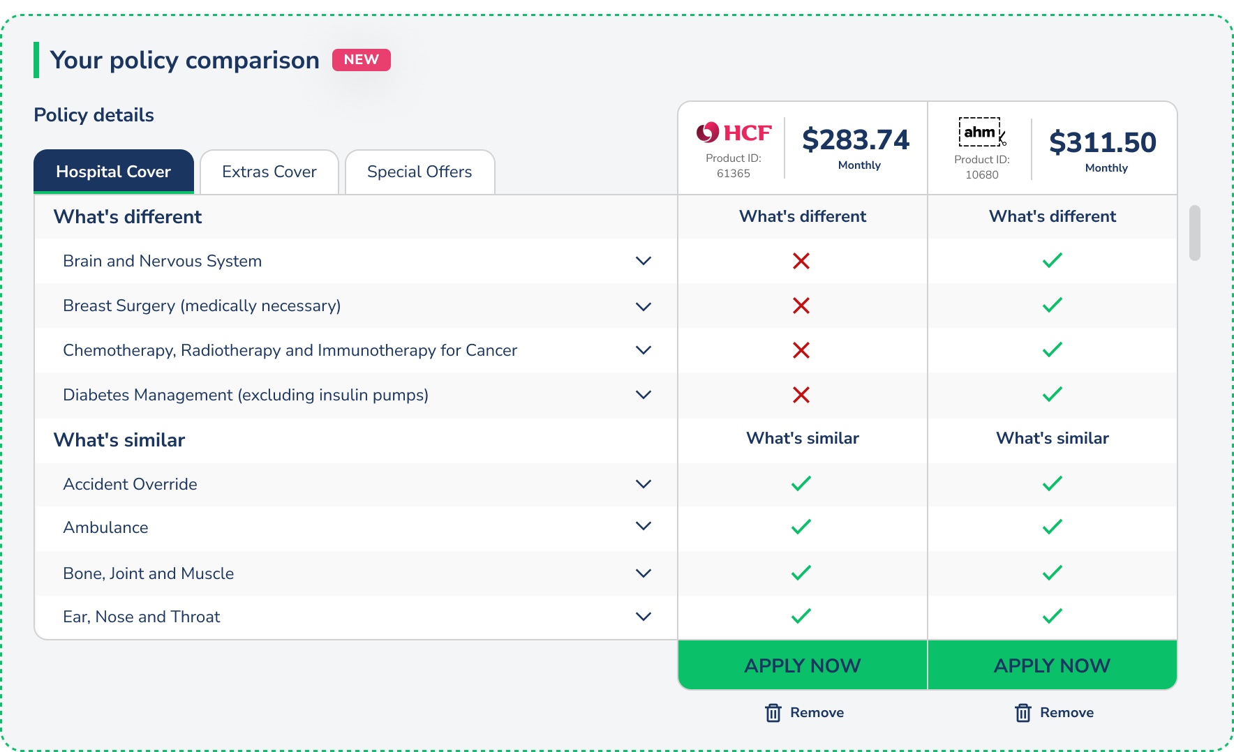
Comparison paralysis. No side-by-side view. Users were trying to memorise details from one policy card, scroll to another, and mentally compare. On mobile, this was impossible.
Mobile friction. Filters didn't work properly on small screens. Tooltips fired but couldn't be dismissed. The layout assumed desktop-first in a 60% mobile audience.
Phone-gate anxiety. The form required a phone number before showing results. Users knew what that meant: sales calls. Many entered fake numbers or abandoned entirely.
Designing the solution
I ran collaborative workshops with engineering, marketing, and product to generate solutions mapped to each breakpoint. Then moved fast into prototyping.
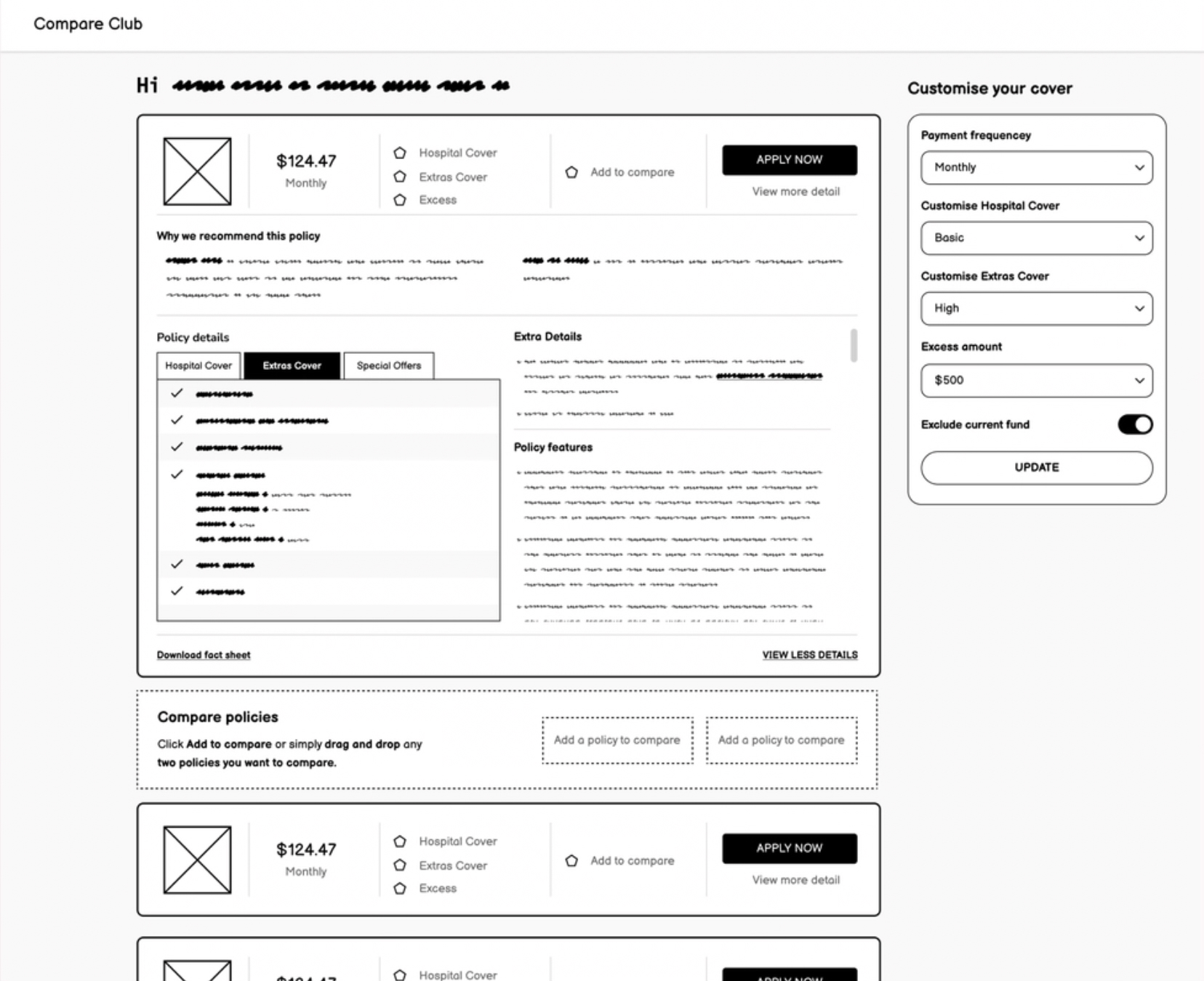
Wireframes first, in Figma. Low-fidelity prototypes built for immediate feedback. I worked directly with engineering through Storybook components so nothing was designed that couldn't be built.
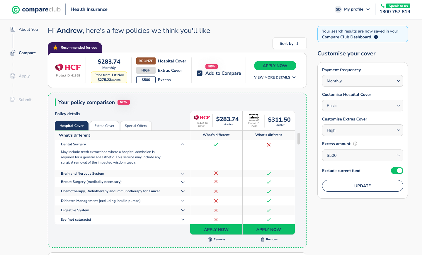
User testing round one. Sessions on UserTesting.com validated the direction. Mobile filter usage jumped from 9% to 31% with the new persistent filter design. The side-by-side comparison view scored 89 out of 100 on the System Usability Scale.
High-fidelity iteration. Based on round one findings, I refined the policy cards (simplified), CTAs (made prominent), and policy detail tabs (reorganised for scannability).
User testing round two (10 moderated sessions). All ten participants preferred the new experience. To control for bias, none were told they were testing Compare Club's product. The feedback centred on clarity: people could finally see the differences between policies and felt confident making a choice.
Key design decisions
Persistent mobile filters. Instead of hiding filters behind a button (the old pattern), I kept them visible and horizontally scrollable at the top of results. This one change drove the 9% to 31% filter usage increase. When people can see their controls, they use them.
Vertical comparison layout. Competitors used horizontal comparison grids. On mobile, horizontal grids force awkward side-scrolling. I designed a vertical layout that stacked policy details in scannable rows. It worked better on every screen size and tested significantly higher in usability sessions.
Inline rebate calculation. Rather than making users calculate their government rebate separately, I built it into the results. Prices update in real time as users adjust their income bracket. Removes a step. Builds trust.
Removing the phone number gate. This was a stakeholder negotiation as much as a design decision. The sales team relied on phone leads. I presented the data showing how many users were abandoning at that exact field, and proposed making it optional post-quote rather than required pre-quote. The compromise unlocked the funnel.
Results
These results validated the investment and shifted the business's strategic direction toward the digital channel. The call centre wasn't going away, but it was no longer the only path to conversion.
What I learned
Combining qualitative insight with hard analytics data made stakeholder conversations easier. When you can show a Hotjar recording of a user failing alongside the funnel data showing where thousands of others failed at the same point, the argument makes itself.
Early engineering involvement changed the quality of what we shipped. Designing through Storybook components meant nothing went through a handoff gap. What I designed is what got built.
And sometimes the biggest UX win isn't a design change at all. Removing a mandatory phone field isn't a clever interaction pattern. It's listening to what users were telling you through their behaviour, and having the data to back the case internally.